In today’s fast-paced digital landscape, where attention spans are short and competition is fierce, optimizing social media graphics for mobile is no longer optional; it’s a necessity. Imagine this: a beautifully crafted graphic that captures your brand’s essence, but when viewed on a mobile device, it’s poorly cropped, illegible, or fails to engage. The difference between a scroll and a click can be as simple as how well your graphics are tailored for mobile viewing.
With over 54% of global social media traffic coming from mobile devices, ensuring that your graphics look stunning and function seamlessly on these platforms is crucial. This guide will walk you through the essentials of creating mobile-optimized graphics, from design principles to testing and analyzing their effectiveness.
Key Takeaways
- Mobile optimization is essential for engaging users, given the dominance of mobile traffic.
- Follow key design principles to ensure your graphics are visually appealing and function well on smaller screens.
- Use the right tools and software to create graphics that are optimized for mobile viewing.
- Test and analyze graphics to understand their performance and make necessary adjustments.
- Stay updated with current trends in mobile graphics to keep your content fresh and engaging.
What are Social Media Graphics and Why Optimizing for Mobile Matters?
Social media graphics encompass any visual content shared across social media platforms, including images, infographics, videos, and even animated GIFs. These graphics play a pivotal role in brand storytelling, audience engagement, and driving conversions.
In an era where nearly 90% of users access social media from mobile devices, optimizing these graphics for mobile is imperative. A graphic that looks great on a desktop might not translate well on a phone. Mobile optimization ensures that your visuals are not only aesthetically pleasing but also functional, enhancing user experience and interaction rates.
Importance of Mobile Optimization
- User Experience: Mobile users expect quick loading times and easy navigation. Poorly optimized graphics can lead to frustration and may drive users away. A seamless experience keeps users engaged and encourages them to explore more content.
- Engagement Rates: Well-optimized graphics can significantly boost engagement, increasing likes, shares, and comments. For instance, posts with images receive 94% more views compared to text-only posts.
- Brand Perception: High-quality visuals reflect a professional brand image, affecting how users perceive your brand. A well-designed graphic can enhance credibility and make users more likely to follow or share your content.
What Are the Best Practices for Mobile Graphic Design?
Key Design Principles for Mobile Graphics
Designing graphics for mobile requires a different approach than desktop design. Here are some key principles to keep in mind:
- Simplicity: Keep designs clean and uncluttered. Avoid overwhelming users with too many elements. A simple design allows the main message to shine through, making it easier for users to absorb information quickly.
- Legible Typography: Use fonts that are easy to read on smaller screens. Stick to 1-2 font styles and use larger sizes for key messages. For example, a headline font should be at least 24pt on mobile to ensure readability.
- High-Quality Images: Ensure images are high resolution to avoid pixelation on various screen sizes. Use 300 dpi images when possible, especially for graphics that include intricate details.
- Contrast and Colors: Use contrasting colors for text and background to enhance readability. Dark text on a light background (or vice versa) is more visually appealing and easier to read.
Common Pitfalls to Avoid in Mobile Graphic Design
- Overly Complex Designs: Complicated graphics can confuse users and dilute your message. Stick to one primary focus point in each graphic.
- Ignoring Aspect Ratios: Different platforms have varying aspect ratio requirements. Always check platform specifications before designing. For example, Instagram stories require a 9:16 ratio, while Facebook posts generally use a 1.91:1 ratio.
- Neglecting Loading Times: Large file sizes can slow down loading times, leading to a poor user experience. Optimize files using compression tools without sacrificing quality.
How to Create Mobile-Friendly Graphics for Social Media?
Creating mobile-friendly graphics involves a systematic approach. Here’s a step-by-step guide:
- Define Your Goals: Understand what you want to achieve with your graphic—brand awareness, engagement, or conversions. Clear goals will guide your design process and ensure your graphics serve a purpose.
- Choose the Right Dimensions: Research the optimal sizes for graphics on different social media platforms. Familiarize yourself with the latest image size guidelines for platforms like Instagram, Facebook, Twitter, and LinkedIn.
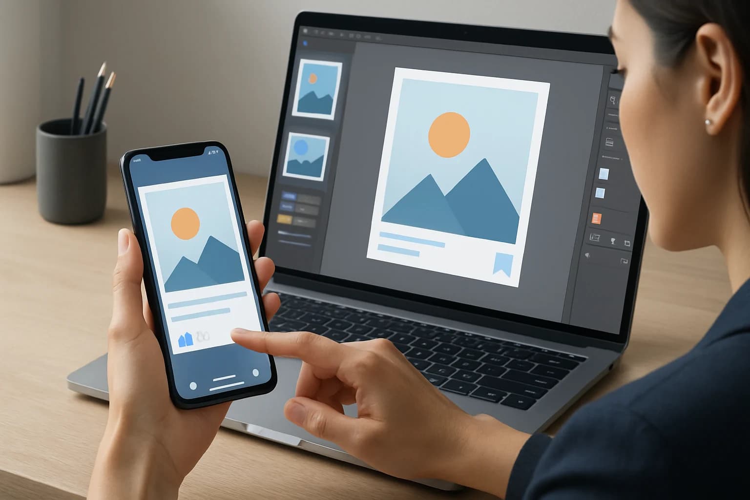
- Select Design Tools: Utilize graphic design tools that cater to mobile optimization. Tools like Canva, Adobe Spark, and Figma can help streamline the design process.
- Create a Prototype: Design a draft version and view it on various devices to check for usability. This step is crucial to ensure your graphics maintain their impact across different screen sizes.
- Seek Feedback: Share your design with team members or potential users for constructive criticism. External perspectives can provide valuable insights and help refine your graphics.
Tools and Software Recommendations for Mobile Graphic Design
- Canva: Offers templates specifically designed for mobile optimization. It’s user-friendly and ideal for beginners.
- Adobe Spark: Great for creating quick and visually appealing graphics with a professional touch. It includes templates for social media platforms.
- Figma: Useful for collaborative design and prototyping. Figma allows multiple users to work on a project simultaneously, making it perfect for team efforts.
How to Test and Analyze Your Mobile Graphics?
Testing your graphics is crucial for ensuring they perform well on mobile. Here’s how to do it effectively:
Importance of Testing Graphics
Testing allows you to identify issues before your graphics go live. It ensures that users will have a seamless experience, which can directly impact engagement and conversion rates. For instance, A/B testing can help you determine which graphic performs better in terms of user engagement.
Metrics to Track for Optimizing Mobile Graphics
- Load Time: Measure how quickly your graphics load on mobile devices. Aim for a load time of three seconds or less for optimal user experience.
- Engagement Rates: Track likes, shares, and comments to evaluate user interaction. High engagement rates typically correlate with effective graphics.
- Bounce Rates: Monitor how many users leave after viewing your graphic. A high bounce rate may indicate that your graphics are not resonating with your audience.
What Are Common Mistakes to Avoid When Optimizing Graphics for Mobile?
When optimizing graphics for mobile, certain mistakes can undermine your efforts. Here’s a list of common pitfalls and how to avoid them:
- Ignoring Mobile-Specific Guidelines: Each platform has its own set of guidelines. Always refer to these before designing. For example, using the correct dimensions ensures your graphics aren’t cropped or distorted.
- Using Small Text: Text that’s too small is hard to read on mobile screens. Always use a minimum font size that is readable without zooming.
- Neglecting Accessibility: Ensure your graphics are accessible to all users, including those with visual impairments. Consider color contrast and use alt text for images where applicable.
How to Keep Up with Social Media Graphic Trends?
Staying updated with the latest trends is essential for keeping your graphics relevant. Here’s how to do that:
Overview of Current Trends in Mobile Graphics
- Minimalism: Clean designs with plenty of white space are trending. Simplicity helps highlight the message without distractions.
- Bold Typography: Big, bold text is becoming more popular to grab attention quickly. This trend helps convey messages effectively in a crowded feed.
- Animated Graphics: GIFs and short videos are more engaging than static images. They can convey a message quickly and are more likely to be shared.
Where to Find Inspiration and Updates on Trends
- Design Blogs: Websites like Behance and Dribbble showcase the latest graphic design trends. Following these platforms can provide a constant source of fresh ideas.
- Social Media: Follow design influencers and brands on platforms like Instagram and Pinterest for inspiration. Hashtags related to graphic design can also lead you to trending content.
- Online Courses: Platforms like Skillshare and Udemy offer courses on current design trends. Learning from industry experts can keep your skills sharp.
Frequently Asked Questions
What size should social media graphics be for mobile?
The ideal size varies by platform. For example, Instagram posts typically use 1080 x 1080 pixels, while Facebook’s recommended size for shared images is 1200 x 630 pixels. Always check the latest guidelines as they frequently change.
How do you optimize images for mobile devices?
To optimize images for mobile, compress file sizes without losing quality, use responsive design techniques, and ensure proper resolution for different screen sizes. Tools like TinyPNG or ImageOptim can help compress images effectively.
What tools can help create mobile-optimized graphics?
Tools like Canva, Adobe Spark, and Figma are excellent for creating mobile-optimized graphics due to their user-friendly interfaces and specific templates designed for various social media platforms.
Conclusion
Optimizing social media graphics for mobile is crucial in today’s digital landscape. By following best practices, utilizing the right tools, and continuously testing and analyzing your graphics, you can significantly enhance user engagement and brand perception.
- Prioritize simplicity and legibility in your designs to ensure clarity.
- Use tools like Canva and Adobe Spark to streamline your graphic creation process.
- Regularly test your graphics to ensure optimal performance across devices.
Take Your Content to the Next Level
Ready to elevate your social media presence? Start implementing these graphic optimization strategies today! Create eye-catching, mobile-friendly graphics that engage your audience and reflect your brand’s identity. Your next scroll-stopping graphic is just a design away!